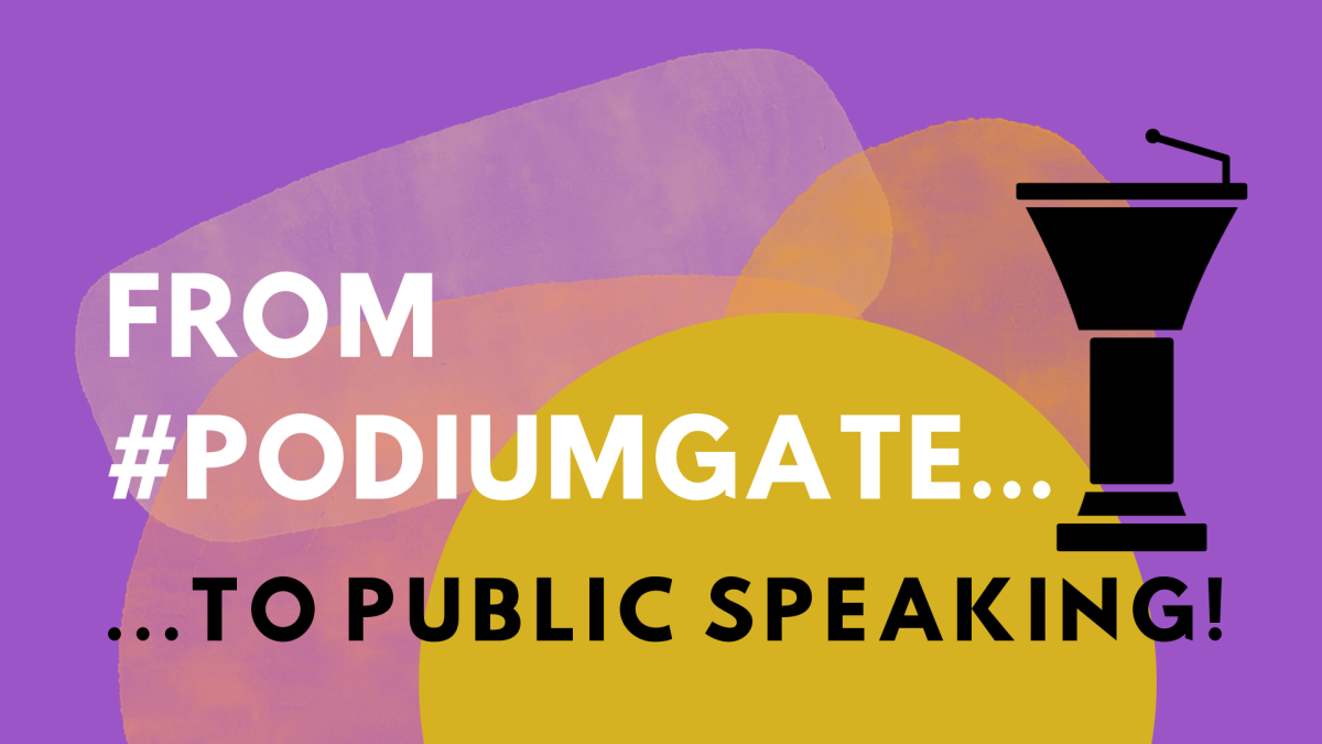
This past month, #PodiumGate has been in the news! It’s a weird story that involves politics, a suspected coverup, and — a super expensive lectern, of all things!
Really? A lectern?
Yes. Really! You can read about it here: ‘#Podiumgate/#Lecterngate’ explained (ualrpublicradio.org).
Hmmm. So, if the political intrigue and brouhaha is over a lectern, why is it known as #PodiumGate? Aren’t a podium and a lectern two different things?
Yes…and no!
A podium is a raised platform that a speaker stands on to be seen by the audience. A lectern is a stand that holds notes, books, or a microphone for the speaker to read from.
However, in modern usage, the words podium and lectern are often interchangeable here in the USA. If you want to keep the two straight in your head, here’s a handy reminder:
1. The word podium comes from the Greek word for foot, so it’s something you stand on. (Think soap box!)
2. The word lectern comes from the Latin word for read, and it has always meant a reading stand. (Think lecture!)

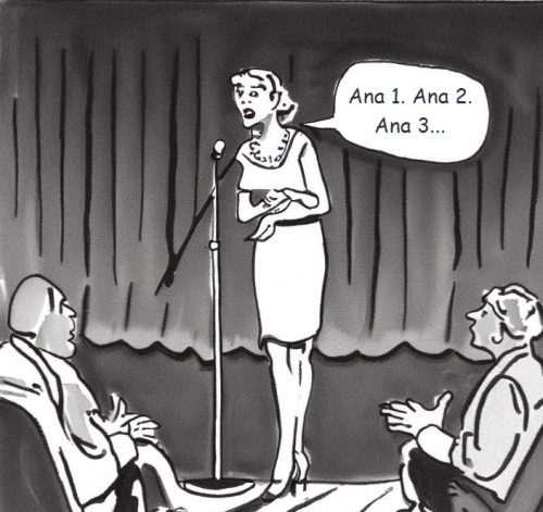
Either way you say it, I’m not a super big fan of speaking behind a lectern. If I can avoid it, I do. That way, my audience is able to see my body language.
That darned lectern creates a physical barrier between me and my audience! It reduces my connection and rapport with them!
So, generally, I step away from the lectern. It shows the audience I’m not hiding anything.
Speaking without a lectern is more honest and vulnerable. Stepping away from the lectern also frees me up physically and emotionally, so I’m able to be more expressive.
But sometimes, I cannot avoid it. I absolutely must speak behind a podium. Why?
Well, most of the time, it’s a matter of staging. For an event like an award ceremony or graduation, you might have many speakers coming on stage to deliver short addresses. The lectern serves as a central point of focus for the audience and speakers.
The lectern also gives speakers a place to hold notes for reading. In that graduation or award ceremony, for example, you might have to read off dozens or hundreds of names and categories. You won’t memorize them: you’ll want to rely on notes.
I did two lectern consults this month. These two clients were new to speaking behind a lectern and needed a little coaching. If you must speak from behind a lectern, try these 4 tips:

Four Tips To Tame the Lectern
1. Adjust the height of the lectern. You don’t want to be too high or too low, so make sure the lectern is at a level where you can see your audience and your notes without straining your neck or bending over. Test the lectern before your speech and adjust it accordingly. Shorter speakers have been known to stand on stools or phone books behind some lecterns! #YouKnowWhoYouAre
2. Use the lectern as a support, not a barrier. One client gripped the lectern to steady herself: but she looked like she was holding on to it as if her life depended on it! You don’t want to white-knuckle, it, though. Loosen up! The lectern is there to help you, not to hide you. Don’t lean on it or clutch it too tightly, as this will make you look nervous and insecure. Instead, use it as a place to rest your hands lightly or to gesture from. If it’s technically feasible, try moving away from the lectern occasionally to create some variety and connect with your audience.
3. Make eye contact with your audience. The lectern is not an excuse to avoid looking at your audience! Try what I call an “Olde Ronald Reagan Trick.” This is where you glance down at your notes or script, memorize a short sentence or phrase, then look up to deliver the line. That way, you’re not reading with your eyes down: you’re looking up! Eye contact is essential for building rapport and engaging your listeners. Try to scan the room and look at different people for a few seconds each. Don’t stare at one person or one spot, as this will make you seem creepy.
4. If you can, use notes, not a script. The lectern is a great place to keep some notes that will remind you of your main points and transitions. However, try not to read from a script word for word. This can make you sound robotic and monotonous. Instead, use your notes as a guide and speak naturally and conversationally. (See “The Olde Ronald Reagan Trick” above!) Instead of full sheets of paper, try using index cards to help you stay on track.
The best way to get comfortable with speaking behind a lectern is to practice with one. Find a lectern that’s similar to the one you will use and rehearse with it. Pay attention to your posture, gestures, eye contact, and voice. As always, you’ll want to record yourself and ask for feedback.
You don’t need to speak from behind a $19,000+ lectern to feel more confident. Follow the above tips and practice your public speaking! That’s the key to confidence!
And speaking of lecterns, you never know when your teleprompter will fail and you’ll have to wing it! When you build your improvisational skills, you can create rapport and connection with your listeners.
That’s why Izzy Gesell, CSP and I developed the Sponto Time card deck! It gives you a fun way to practice public speaking and improv skills. Yes, you can practice being spontaneous — and have a blast while doing it!
More good news: the Sponto Time game doesn’t cost $19,000. It’s only $19.99!
Check out Sponto Time to find out more about building your spontaneity muscles! The card games make a great stocking stuffer gift for both business leaders and family members who want to sharpen their creativity skills.